Alternate Stormlight Symbol Reveal

Art director Isaac here with an art reveal today. Recently Brandon, Kara, and Adam have been discussing publicity for Rhythm of War, and one thing that Tor has asked for is a simplified symbol to represent the Stormlight Archive on certain marketing materials.
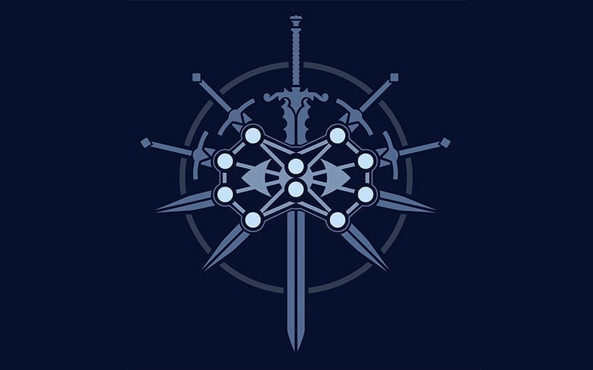
Now, to be clear, we love the original Stormlight Archive symbol, and we are in no way abandoning or replacing it. Many readers have bought shirts and decals or have even gotten tattoos of it. We are using it in The Way of Kings leatherbound and will continue to use it as a chapter icon in Rhythm of War and future Stormlight books. So rest assured that we are not retiring this tried and true iconic symbol.
However, the symbol is complex, and it doesn’t read well at small sizes, so at Tor’s request, we’ve sought a simplified design. During this search, it occurred to Brandon and me that eventually we’ll need simplified symbols for all of the Cosmere worlds—symbols that will need to be easily recognizable from far distances—basically, space-era versions of our current symbols.
So, after hundreds of drawings and thumbnails, we’re unveiling to you now the space-era symbol for the Stormlight Archive.

We’ve built this on the skeleton of the original symbol, preserving the relationship between the sword, circle, and main focal point. Instead of extra swords, we have rays of light. Instead of the complex double-eye of the Almighty, we’ve chosen the burst of light from the original Cosmere symbol.
Going forward, we will actively use both this symbol and the original in promoting the Stormlight Archive, and eventually you can expect space-age versions of many of the current Cosmere planetary symbols.


