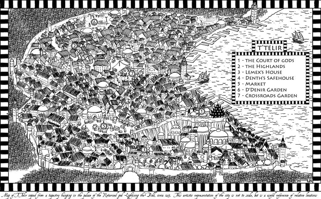
Annotation Warbreaker Map


The map for this book was done by the awesome Shawn Boyles.
For this book, I wanted something with an illustrated feel to it. The Mistborn maps were supposed to look realistic and gritty—like maps from London during the nineteenth century. I wanted twisting, cramped streets and a sense of overcrowding.
For Warbreaker I wanted a very different feel. I wanted a picture that looked hand drawn, something a little exaggerated and intentionally less accurate. Like a picture you might see hanging on someone’s wall, vaguely showing the size, shape, and relative locations of important things in the city.
I picked Shawn because of his style. He has a very colorful, very round and smooth style, and I thought that would translate very well to a map of the city. Ironically, the first map he gave me looked very detailed and intricate, much like the Mistborn maps. He was trying way too hard, I feel—imitating the style of the previous books.
I asked him for something that was more natural to his style, something that was a profile view rather than an overhead view and had stylized houses. The second draft came back nearly perfect; I was very excited. The only problem with that one was that it wasn’t big enough. (It was about half the size of the final product and didn’t have the upper portion of the map where the city curves around the bay.)
One more draft, however, and we were finished. He did the artwork by hand on a large piece of cardstock, then scanned it and filled in details on the computer. I love the finished product. I wish we could have done colored end pages using it.


