Isaac Stewart on the artwork for Sixth of the Dusk
Brandon’s assistant Isaac here to talk about the process of creating the ebook cover for Sixth of the Dusk.
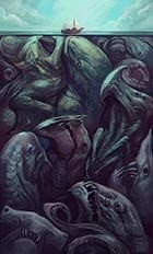
 We knew from the beginning of the Shadows Beneath anthology project that at some point we wanted to release Brandon’s story by itself, especially for those who just wanted the story apart from the extra content about the writing process. Even as I searched artists and images for the anthology cover—and eventually settled on the now-Hugo-Award-winning Julie Dillon’s lovely kaiju illustration—I was on the lookout for something we could eventually use for Sixth of the Dusk.
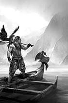
For the anthology interior, we commissioned a black-and-white illustration from the talented Kekai Kotaki, so in looking for a cover image, I wanted to find something that could complement Kekai’s vision of the story. We’re not quite looking at a tropical paradise here, so I wanted something that said beautiful, lush, and tropical, yet rugged and adventurous at the same time.
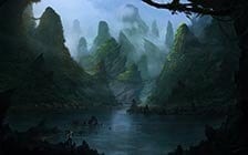
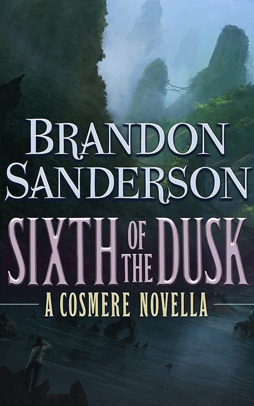
 Often we commission art for our interiors and covers, but in this case during my search for the Shadows Beneath cover image, I’d set aside an image that I thought might work. I showed it to Brandon, and he agreed, and afterward I contacted the artist, Jorge Jacinto, who let us license the image from him. Going above and beyond, Jorge also touched up the illustration to match the text, adding Dusk and his birds as the foreground figure. This bit of customization only improved upon an already wonderful painting. In the final cover I wound up tilting it a bit to 1) fit all the elements in that I felt portrayed the story and 2) add a few dynamic diagonal lines to the final cover composition.
Typographically I wanted to tie Sixth of the Dusk to its mother publication, Shadows Beneath, so I returned to those earlier files and lifted the style we’d created for the anthology and began adapting it to an ebook-only release of Sixth.
Sometimes we create two different covers. In the case of Shadows Beneath, we altered the text size from the print to the ebook version in order to make the image and title more legible at thumbnail size. In ebook covers, bigger, bolder, more contrast, and less visual noise often work for a more successful image. The thumbnail needs to be attractive and legible to readers looking for a particular book, or a particular kind of book. Here you can see the difference between the print book and the ebook.
Hardcover:
Ebook:
With Sixth of the Dusk, I jumped right into the “make it big and legible” mindset. I wanted readers to see the title and be intrigued, I wanted Brandon’s name prominent so that his fans would recognize that this is a story for them, and I wanted those same readers to know that this is a story that takes place in Brandon’s connected universe, the Cosmere.
The straight porting of the beveled text wasn’t quite working for me. It was looking too busy visually, and I didn’t like what was going on with the bevel on the X in particular, so I stepped back. The fonts worked fine for me, so I returned the text to its raw form and began building up from there, eventually settling on a flatter, cleaner look, which I think links the story to the original anthology while at the same time working well within the world of the new illustration.
I haven’t mentioned yet how much I love Sixth of the Dusk. It’s a beautiful, engaging story, that not only expands Brandon’s Cosmere, but also poses some interesting questions worthy of contemplation. I hope you enjoy reading it!


